Absolute Quantitation
Notebook Code: ![]() Notebook Prose:
Notebook Prose: ![]()
A common goal in chromatography is to quantify with physically meaningful units the concentration of an analyte in a solution. While Chromatography will not give that to you directly off the instrument, you can prepare a “standard curve”–a set of solutions where you know the concentration of the analyte of interest. With a properly configured machine, one can make a direct linear relation between the integrated area of a peak and the concentration of the analyte. In this tutorial, we will use
hplc-py to quantify a standard curve of a lactose solution and then use the .map_peaks method of the Chromatogram object to test our calibration curve.
Generating a Calibration Curve
Here, we will use hplc-py to quantify aqueous solutions of lactose in different concentrations. These files have been preprocessed to have the known lactose concentration in the file name.
[1]:
import glob

# Get the list of files
files = glob.glob('data/calibration/lactose*.csv')
print(files[0])
data/calibration/lactose_mM_6.csv
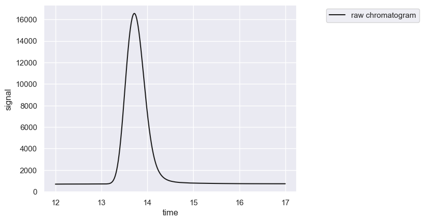
We can load this file into memory as a chromatogram using the load_chromatogram function from the io module and instantiate a Chromatogram object.
[2]:
from hplc.io import load_chromatogram
from hplc.quant import Chromatogram

# Load and display the first file.
df = load_chromatogram(files[0], cols=['time', 'signal'])
chrom = Chromatogram(df)
chrom.show()
[2]:
[<Figure size 640x480 with 1 Axes>, <Axes: xlabel='time', ylabel='signal'>]
As a reminder, we can quickly quantify this single peak by calling the .fit_peaks method.
[3]:
# Quantify the peak
peaks = chrom.fit_peaks(verbose=False)
chrom.show()
peaks.head()
[3]:
| retention_time | scale | skew | amplitude | area | signal_maximum | peak_id | |
|---|---|---|---|---|---|---|---|
| 0 | 13.56 | 0.281228 | 1.654595 | 8004.240816 | 960508.897906 | 15977.970977 | 1 |
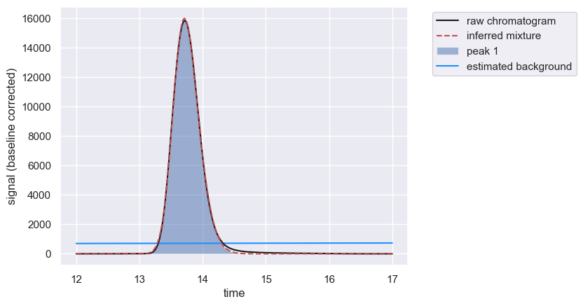
While it’s useful to know the various parameters returned by the fitting, we are fundamen We are interested in the integrated area of the peak (integrated over the entire duration of the chromatogram). Using a for loop and getting the concentration of lactose from each file name, we can generate a new Pandas DataFrame which will hold the calibration information.
[4]:
import pandas as pd
# Set up a blank dataframe for the calibration curve.
cal_curve = pd.DataFrame([])

# Iterate through each file and perform the quantitation
for f in files:
    df = load_chromatogram(f, cols=['time', 'signal'])
    chrom = Chromatogram(df)
    peaks = chrom.fit_peaks(verbose=False)

    # Get the concentration of lactose from the file name
    conc = float(f.split('_')[-1][:-4])

    # Add the concentration to the peak table and add it
    # to the instantiated calibration dataframe
    peaks['conc_mM'] = conc
    cal_curve = pd.concat([cal_curve, peaks])

cal_curve
[4]:
| retention_time | scale | skew | amplitude | area | signal_maximum | peak_id | conc_mM | |
|---|---|---|---|---|---|---|---|---|
| 0 | 13.56 | 0.281228 | 1.654595 | 8004.240816 | 960508.897906 | 15977.970977 | 1 | 6.0 |
| 0 | 13.56 | 0.278886 | 1.627672 | 747.107260 | 89652.871210 | 1496.949321 | 1 | 0.5 |
| 0 | 13.56 | 0.278874 | 1.629961 | 1540.315414 | 184837.849638 | 3087.620065 | 1 | 1.0 |
| 0 | 13.56 | 0.280349 | 1.644179 | 3896.489630 | 467578.755562 | 7787.982871 | 1 | 3.0 |
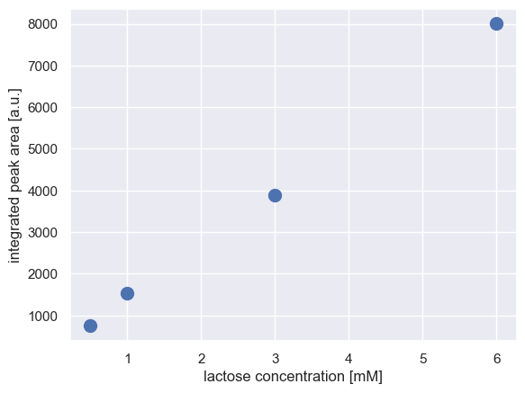
We can now plot the peak area as a function of time, which we expect to appear linear.
[5]:
import matplotlib.pyplot as plt

# Plot the calibration curve.
plt.plot(cal_curve['conc_mM'], cal_curve['amplitude'], 'o', markersize=10)
plt.xlabel('lactose concentration [mM]')
plt.ylabel('integrated peak area [a.u.]')
[5]:
Text(0, 0.5, 'integrated peak area [a.u.]')
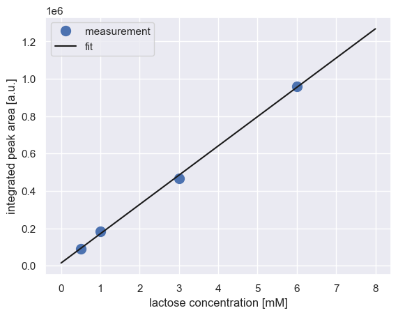
We can perform a simple regression on these data to get a calibration curve.
[6]:
import numpy as np
from scipy.stats import linregress

#  Compute the best fit calibration curve
fit_params = linregress(cal_curve['conc_mM'], cal_curve['area'])
slope = fit_params[0]
intercept = fit_params[1]

# Plot the fit over the data
conc_range = np.linspace(0, 8, 100)
cal = intercept + slope * conc_range
plt.plot(cal_curve['conc_mM'], cal_curve['area'], 'o', markersize=10, label='measurement')
plt.plot(conc_range, cal, '-', color='k', label='fit')
plt.xlabel('lactose concentration [mM]')
plt.ylabel('integrated peak area [a.u.]')
plt.legend()
[6]:
<matplotlib.legend.Legend at 0x14fca6860>
Testing the Calibration
We also have a set of lactose solutions with known concentrations that we did not use when fitting the calibration curve. We can use the .map_peaks method when quantifying these test data to see if we get the same concentrations out that we know the peaks represent.
[7]:
# Load the test data
files = glob.glob('data/test/lactose*.csv')

# Instantiate a dataframe to store the results
test_data = pd.DataFrame([])

# Iterate through each file and quantify the peaks
for f in files:
    df = load_chromatogram(f, cols=['time', 'signal'])
    chrom = Chromatogram(df)
    peaks =  chrom.fit_peaks(verbose=False)

    # Now, use the map_peaks method to quantify the signal based off our
    # calibration curve
    mapping = {'lactose': {'retention_time': 13.56,
                           'slope': slope,
                           'intercept': intercept,
                           'unit': 'mM'}}
    measured_conc = chrom.map_peaks(params=mapping)

    # Parse the known concentration from the file name
    known_conc = float(f.split('_')[-1][:-4])

    # Add it to the dataframe and concatenate
    measured_conc['true_conc_mM']  = known_conc
    test_data  = pd.concat([test_data, measured_conc])
test_data
[7]:
| retention_time | scale | skew | amplitude | area | signal_maximum | peak_id | compound | concentration | unit | true_conc_mM | |
|---|---|---|---|---|---|---|---|---|---|---|---|
| 0 | 13.56 | 0.281437 | 1.664340 | 10715.395193 | 1.285847e+06 | 21414.173961 | 1 | lactose | 8.118513 | mM | 8.0 |
| 0 | 13.56 | 0.280571 | 1.649106 | 5316.475249 | 6.379770e+05 | 10627.640549 | 1 | lactose | 3.981019 | mM | 4.0 |
| 0 | 13.56 | 0.279941 | 1.638944 | 2600.265354 | 3.120318e+05 | 5201.011260 | 1 | lactose | 1.899435 | mM | 2.0 |
| 0 | 13.56 | 0.279515 | 1.636055 | 2154.007783 | 2.584809e+05 | 4312.738273 | 1 | lactose | 1.557443 | mM | 1.5 |
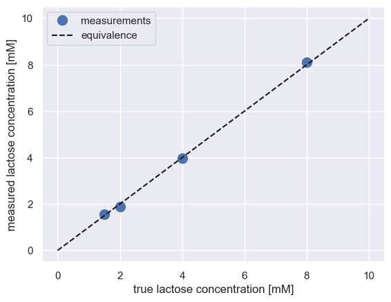
It looks like it’s in good agreement! We can confirm this by plotting the measured value versus the true value. If in agreement, everything should fall on the identity line.
[8]:
# Plot the measured versus known value of the test set
plt.plot(test_data['true_conc_mM'], test_data['concentration'], 'o',
         markersize=10, label='measurements')
plt.plot([0, 10], [0, 10], 'k--', label='equivalence')
plt.xlabel('true lactose concentration [mM]')
plt.ylabel('measured lactose concentration [mM]')
plt.legend()
[8]:
<matplotlib.legend.Legend at 0x14fd33f40>
© Griffin Chure, 2024. This notebook and the code within are released under a Creative-Commons CC-BY 4.0 and GPLv3 license, respectively.