5 Data Visualization
In the previous sections, we emphasized that a good quantitative analysis requires carefully generated data as a starting point. Visualization is commonly the next step in this process. Within the triangle of quantitative biology, visualization acts as a bridge. It allows us to explore structure in data, assess assumptions, generate hypotheses, and evaluate whether proposed models capture observed patterns. Visualization is also essential to communicate scientific results.
Importantly, visualization is not a passive presentation step. Choices made during visualization shape how data are perceived, which patterns stand out, and which sources of variability are emphasized or obscured. Well-designed visualizations reveal structure and guide interpretation, while poorly designed figures can hide important features or even mislead.
5.1 Visualization as a transformation
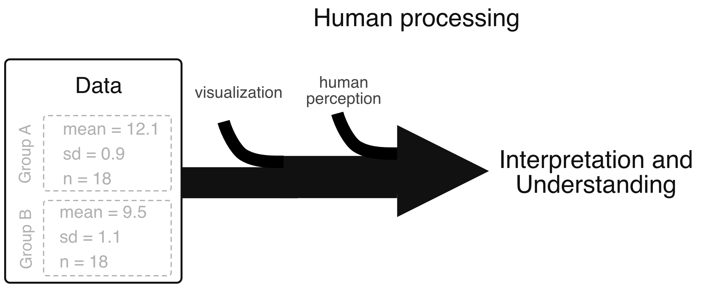
When we analyze data visually, we do not directly perceive numbers underlying a plot. Instead, values are encoded as graphical elements (such as positions, lengths, colors, or shapes) which are then interpreted by our visual system. Human vision is particularly effective at detecting patterns, trends, and relative differences, yet comparatively poor at precise quantitative comparison. As a result, visualization is not a neutral mirror of the data: the impression we form depends not only on the underlying biological and technical variability, but also on how the data are visually encoded.
Seen in this context, visualization adds an additional layer of transformation between biological processes and scientific interpretation (Fig. 5.1). Just as experimental design, measurement, and data processing determine which sources of variability enter a dataset, visualization choices determine which aspects of that variability are emphasized, suppressed, or obscured. Some encodings highlight trends while downplaying dispersion; others can make noise appear as real trends or hide systematic bias.
5.2 Color perception and quantitative meaning
Color provides a clear example to illustrate how perception shapes quantitative interpretation. Human vision does not respond linearly to physical properties of light. Instead, color and brightness are reconstructed by the brain from the combined responses of different photoreceptor cells. As a consequence, equal numerical changes in color values do not necessarily correspond to equal perceptual changes.
In many visualizations, especially heat maps and image-based plots, numerical values are mapped to color values. Importantly, the resulting perception of plots can strongly depend on this mapping. Many color maps exaggerate small variations, introduce artificial boundaries, or obscure meaningful gradients in the data, even when the underlying values change smoothly.
Modern computer displays further complicate this picture. Colors are typically represented as combinations of red, green, and blue intensities, which are convenient for computers but not designed to ensure perceptually uniform interpretation. A careful color choice is therefore essential when color is used to encode quantitative information.
As a practical guideline, perceptually uniform colormaps, such as viridis, cividis, plasma, or inferno for continuous data, are preferred. These maps preserve perceptual ordering and avoid artificial visual boundaries.
These perceptual differences become particularly apparent when visualizing the same dataset with different color maps. Identical data can appear smooth or segmented, uniform or highly structured, depending solely on the chosen color scale. Figure 5.2 illustrates this effect by showing the same data visualized with different colormaps.
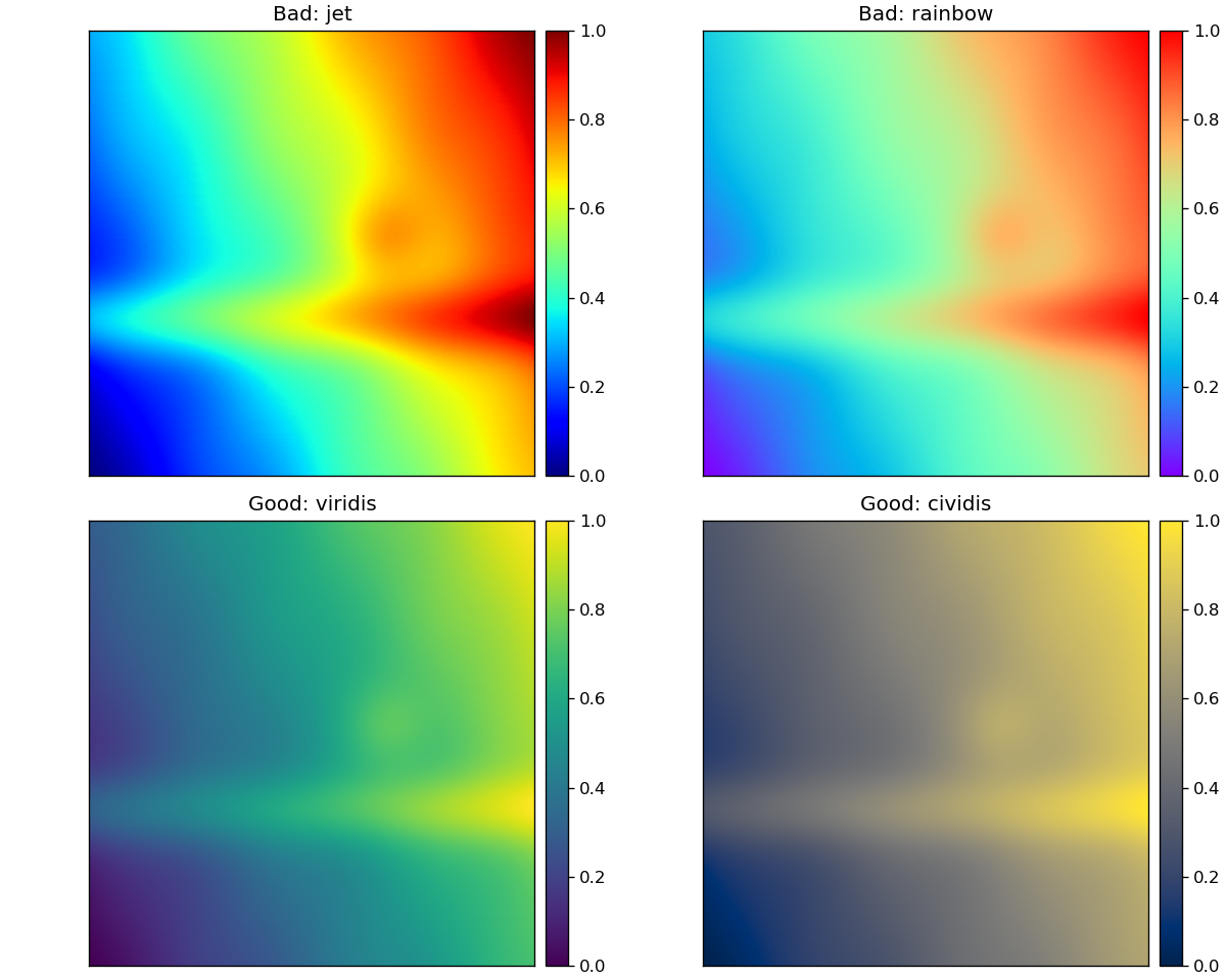
jet and rainbow introduce perceptual nonuniformities and artificial boundaries that can exaggerate or obscure structure. Perceptually uniform colormaps (e.g. viridis and cividis) preserve quantitative ordering and support more reliable interpretation of continuous data.
5.3 Beyond color: other perceptual constructions
Color is only one way in which visualization interacts with perception. Other design choices can similarly shape interpretation. Three-dimensional plots are a prominent example. While visually appealing, 3D plots introduce depth cues, such as perspective, occlusion, and shading, that our brain automatically interprets. These cues often distort quantitative relationships, making it difficult to accurately compare values or assess distances along different axes.
In most cases, 3D plots obscure rather than clarify quantitative structure, particularly when used to display inherently two-dimensional data. Differences in viewing angle can change the apparent relationships between data points, and important features may be hidden behind others. For these reasons, 3D visualizations are rarely appropriate for quantitative analysis and should generally be avoided in favor of simpler, two-dimensional representations.
Another common challenge arises in scatter plots when the number of data points is large. Overplotting can cause many points to overlap, making dense regions appear artificially sparse and hiding the true distribution of the data. In such cases, the apparent “noise” in a plot may reflect visualization choices rather than properties of the data themselves. Transparency, jittering, aggregation, or alternative representations are often necessary to accurately convey data density and variability.
More generally, visual parameters such as marker size, line width, smoothing, and plot dimensions influence which features of the data appear salient. While these tools can be used responsibly to improve readability, they can also unintentionally downplay variability or exaggerate structure. Thoughtful visualization design therefore requires awareness of how these choices affect perception.
5.4 Guiding principles for effective visualization
Taken together, these considerations lead to several general guidelines for good scientific visualization.
Good plotting practices include:
Show the data directly whenever possible, rather than relying solely on summaries or interpolations.
Prefer clarity over decoration, and choose visual encodings (position, color, size, shape) intentionally.
Provide clear axis labels, units, legends, and annotations to support quantitative interpretation.
Use color schemes that preserve perceptual ordering and quantitative structure.
Explicitly represent variability and uncertainty (e.g. distributions, confidence intervals, error bars), not just point estimates.
Use consistent scales, colors, and encodings across related figures to facilitate direct comparison.
Choose plot sizes and layouts appropriate for the intended medium (screen, print, presentation).
Conversely, several common practices should generally be avoided:
Avoid truncated axes that exaggerate differences.
Avoid non-perceptual or misleading color scales.
Avoid bar plots for continuous data when the underlying distribution is of interest.
Prevent overplotting that hides data density or structure.
Avoid misleading smoothing, interpolation, or overfitted trend lines.
Avoid three-dimensional plots for quantitative data analysis.
Overall, effective visualizations are simple, familiar, and transparent in how they encode data, allowing the reader to focus on the underlying patterns rather than on the graphical design itself.
For further reading we recommend the good summary article by Rougier et al “Ten Simple Rules for Better Figures” available at https://pmc.ncbi.nlm.nih.gov/articles/PMC4161295/.